A Card That Arrived Without a Date
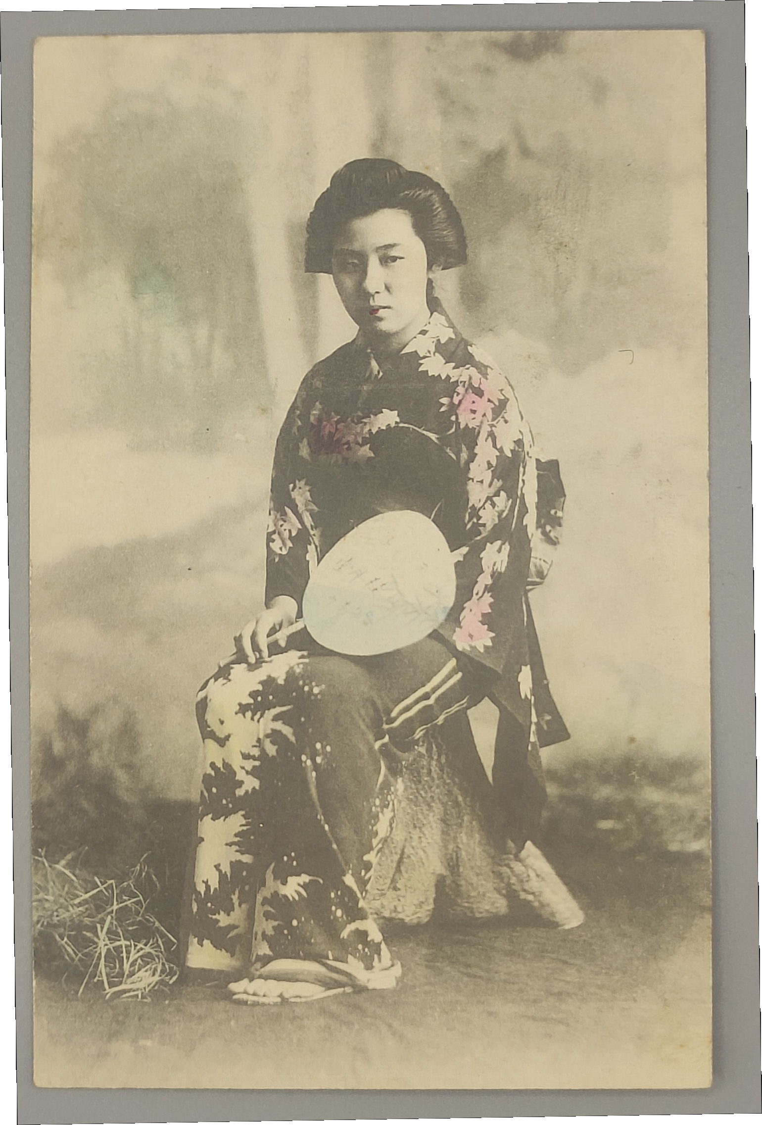
Wandering the antiquarian bookshops of Jinbocho, you encounter objects like this from time to time. Something clearly old — but nobody will tell you exactly how old. The postcard I recently acquired was precisely that kind of piece.
A woman in kimono, holding an uchiwa fan, looks out at the camera from somewhere outdoors. Her lips carry a pale wash of red; the flowers near her shoulder have been touched with a soft, muted colour. At first glance it might look like any of the tinted cards that turn up in the old-print trade. But on closer examination, this particular card contained a remarkable number of clues about when it was made.
First Question: Printing or Handwork?
The category of “coloured postcard” covers a wide range. There are mass-produced, colour-printed cards from later decades, and there are hand-tinted real photo postcards — Meiji and Taishō-era photographs on which a craftsman applied colour by brush, one card at a time. They may look similar at a glance, but their collectible significance is entirely different.
The test is simple: magnify the coloured area and look for a halftone dot pattern. If you can see dots, you are looking at an offset or lithographic print — a mass-market product. If the colour sits cleanly within the outlines, with no dots visible and no bleeding into the grey tones of the photographic background, then you have a one-of-a-kind silver-gelatin photograph with colour applied by hand.
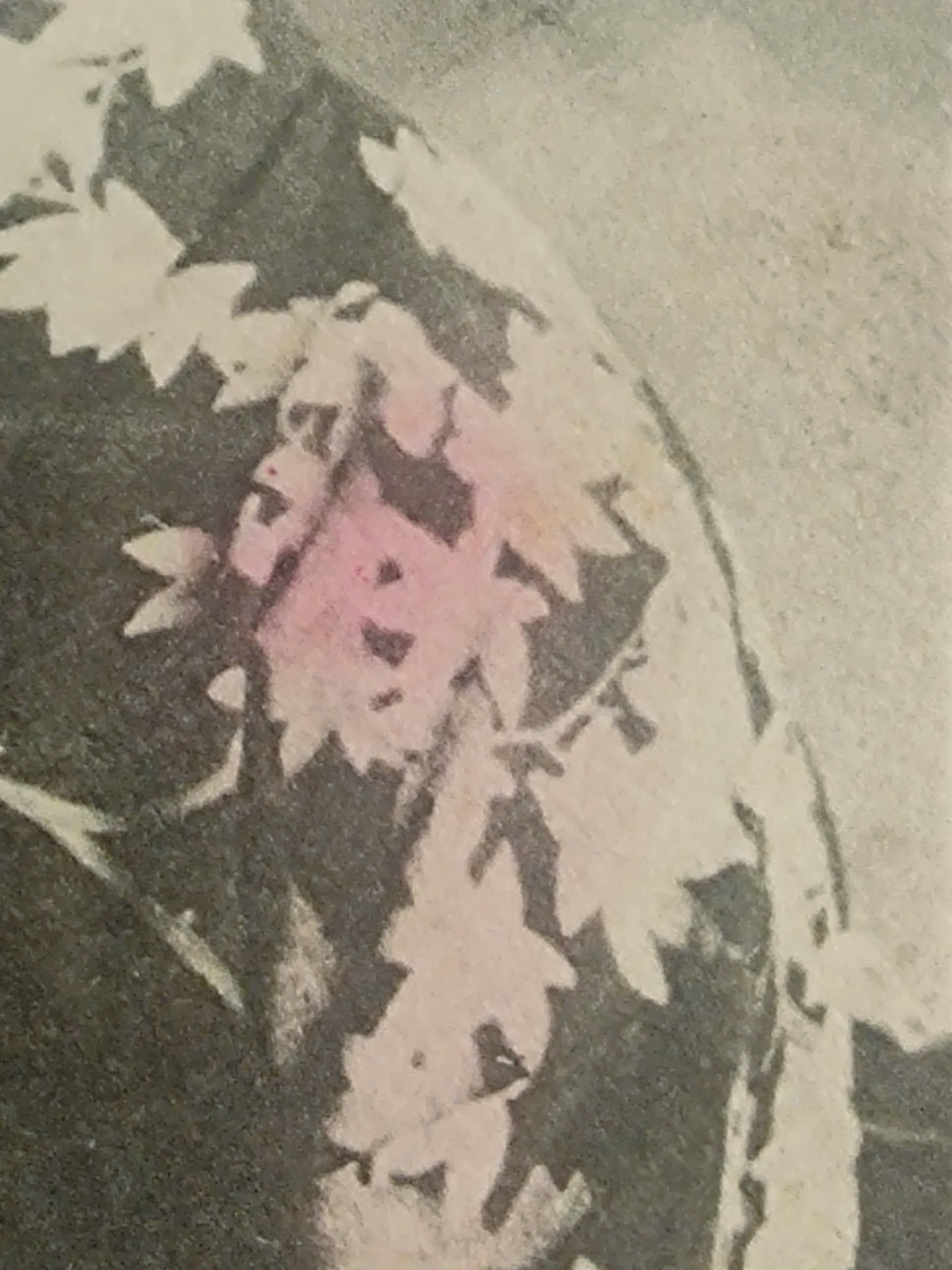
When I examined the lip and flower colouring under a loupe, no dot pattern was visible. The pigment sat neatly inside the outlines of each element, with none of the registration drift or ink spread characteristic of printing. The grey tones of the photographic ground were entirely unaffected — the colour had been placed by hand with a fine brush, selectively, on the finished print.
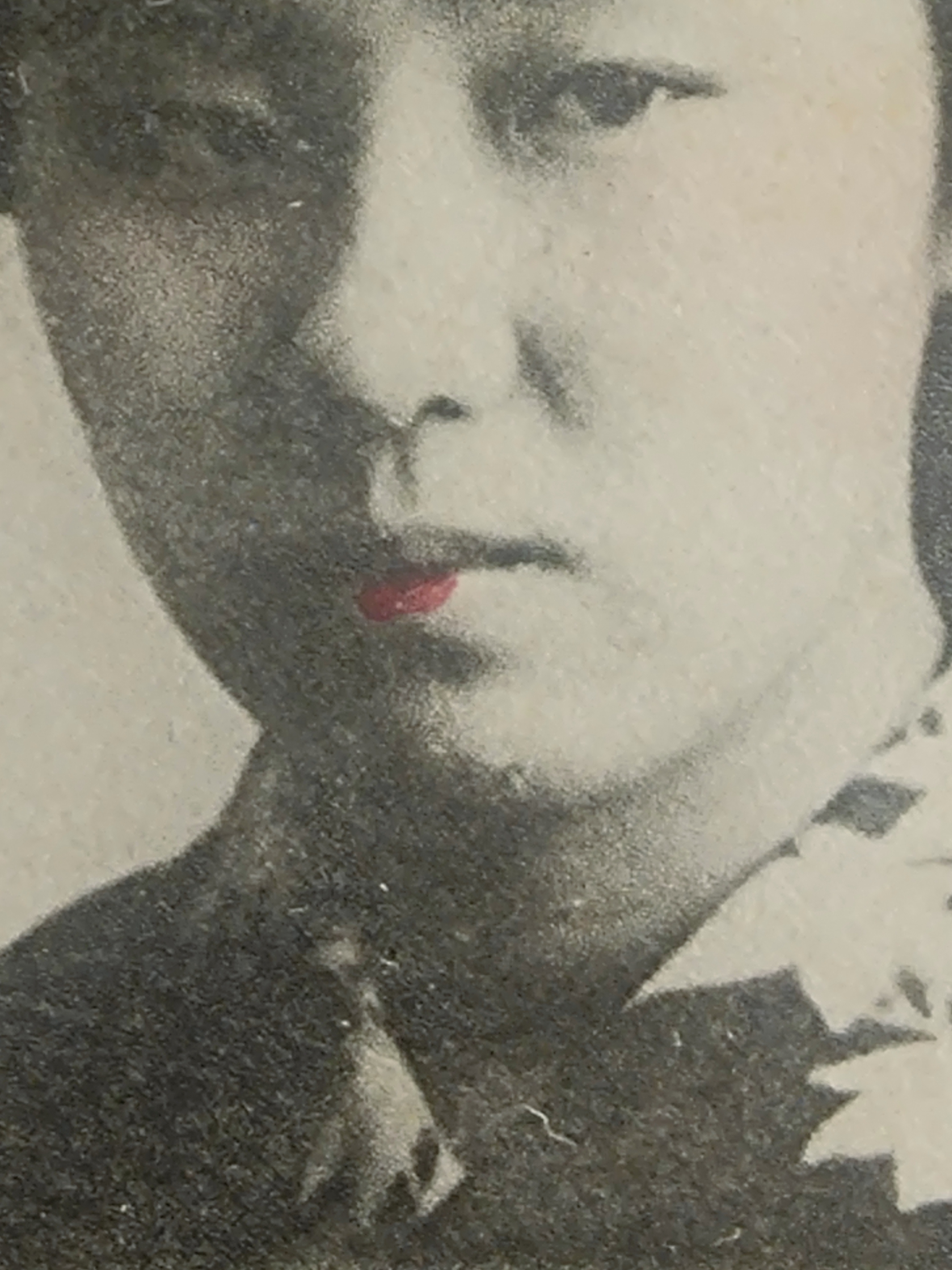
This is a genuine hand-tinted real photo postcard: a silver-gelatin photograph coloured by a craftsman working on individual prints, not a printed reproduction.
What the Back Reveals — Three Characters That Place It in Time
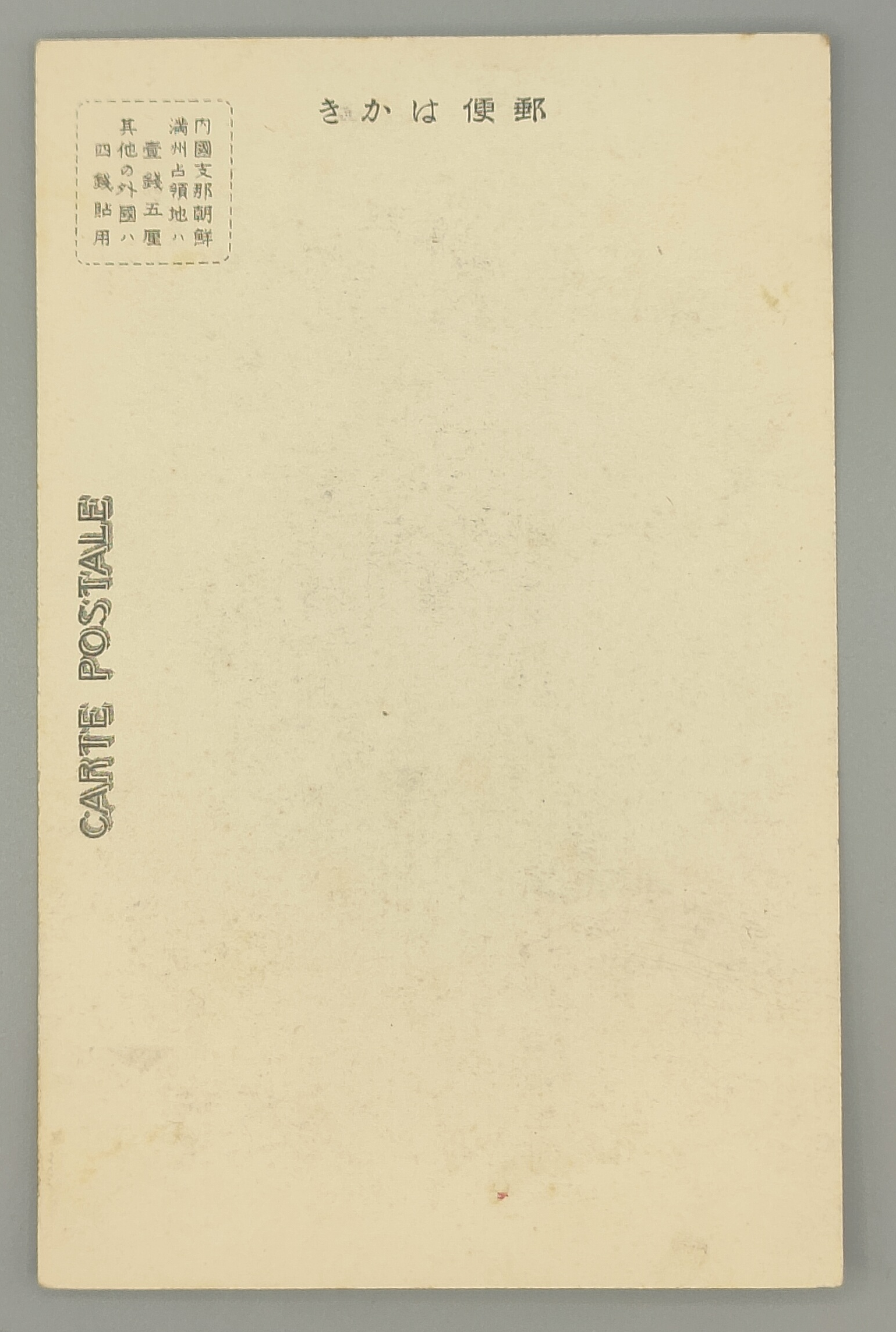
For dating postcards, the reverse side is usually more informative than the photograph. Japanese postcard formats changed repeatedly from the Meiji era through the Shōwa period, and small differences in the design of the address side can narrow the date of manufacture considerably.
The back of this card carries a bordered box stating the applicable postal rates. The text reads:
For domestic mail, China, Korea, and Manchurian occupied territories: 1 sen 5 rin. For all other foreign destinations: 4 sen.
The phrase Manchurian occupied territories (満州占領地) is the key. Japan acquired rights in southern Manchuria through the Treaty of Portsmouth in September 1905, following the Russo-Japanese War — but the formal administrative structure (the Kwantung Governor-General’s Office) was not established until September 1906. In the transitional period before that, when the territory was under military administration, “occupied territory” was the designation in use. After the Manchurian Incident of 1931, the nomenclature shifted quickly to “Manchukuo.” It is difficult to imagine this phrase appearing on a postal rate table for long after that transition. The word itself is strong evidence pointing to the immediate post-Russo-Japanese War period: approximately 1905 to 1906.
A Second Line of Evidence: The Address-Side Layout
What made the dating even more precise was the structure of the reverse side itself — specifically, the presence or absence of a dividing line separating the address field from the message area.
Japanese postcard design can be periodised fairly accurately by this feature:
- Meiji 33–39 (1900–1906): No dividing line — no space for private correspondence on the address side.
- Meiji 40 – Taishō 7 (1907–1918): Dividing line occupying one-third of the address side.
- Taishō 7 (1918) onward: Dividing line occupying half the address side.
- Shōwa 8 (1933) onward: The heading yūbin hakaki gains a voiced marker, becoming yūbin hagaki.
The address side of this card has no dividing line at all, and the heading carries no voiced marker. This matches exactly the characteristics of the Meiji 33–39 period (1900–1906).
Two Independent Clues, One Conclusion
This is what makes the card particularly interesting to examine. The date implied by the phrase Manchurian occupied territories — the immediate post-Russo-Japanese War period, roughly 1905–1906 — and the date implied by the address-side layout — 1900–1906 — are derived from entirely separate physical features of the card. They converge on the same window.
One clue alone would give a rough approximation. But two independent pieces of physical evidence, neither of which has anything to do with the photograph itself, arriving at the same conclusion — that is what gives this dating its confidence.
The final conclusion: this is a hand-tinted real photo postcard made in approximately Meiji 33–39 (1900–1906). It was produced during the tumultuous years bracketing the Russo-Japanese War — when picture postcards themselves were still a relatively new phenomenon in Japan, still finding their place in the culture.
Memory Held in Paper
If you looked only at the woman’s expression — soft, direct, unhurried — you would have no way of knowing what era produced this card. But the three characters on the back, occupied territories (占領地), and the undivided address field beneath them, quietly name a moment more than 120 years ago.
That is the particular pleasure of working with old objects. The surface has beauty. But what lies behind the surface — the small pieces of evidence left by design conventions and administrative language — is where you begin to understand what a piece has actually lived through.